The Project
Gina Donnelly’s now multi-award winning gig theatre show Anthem For Dissatisfaction needed an identity as loud and energetic as the play itself to stand out in the Fringe touring circuit in the UK and Europe. The play centres on the role of live music as both escape and survival told throughout the lives of two working-class siblings.
The DESIGN
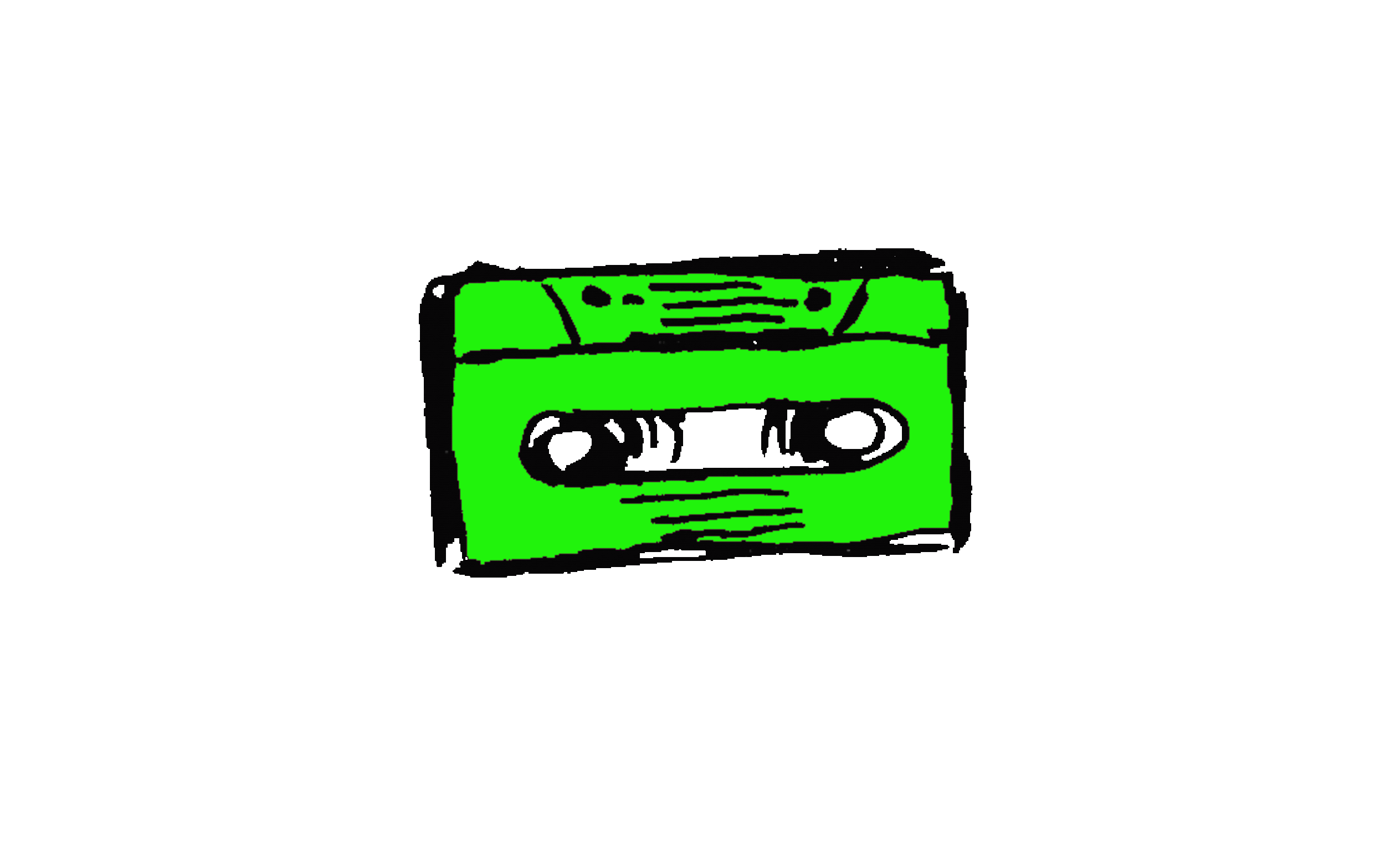
I designed the full visual identity that has been used across print and digital with an adaptable design that reflects the high energy of the show. Drawing inspiration from the d.i.y live music culture for the poster, promotional and tour graphics and merch.
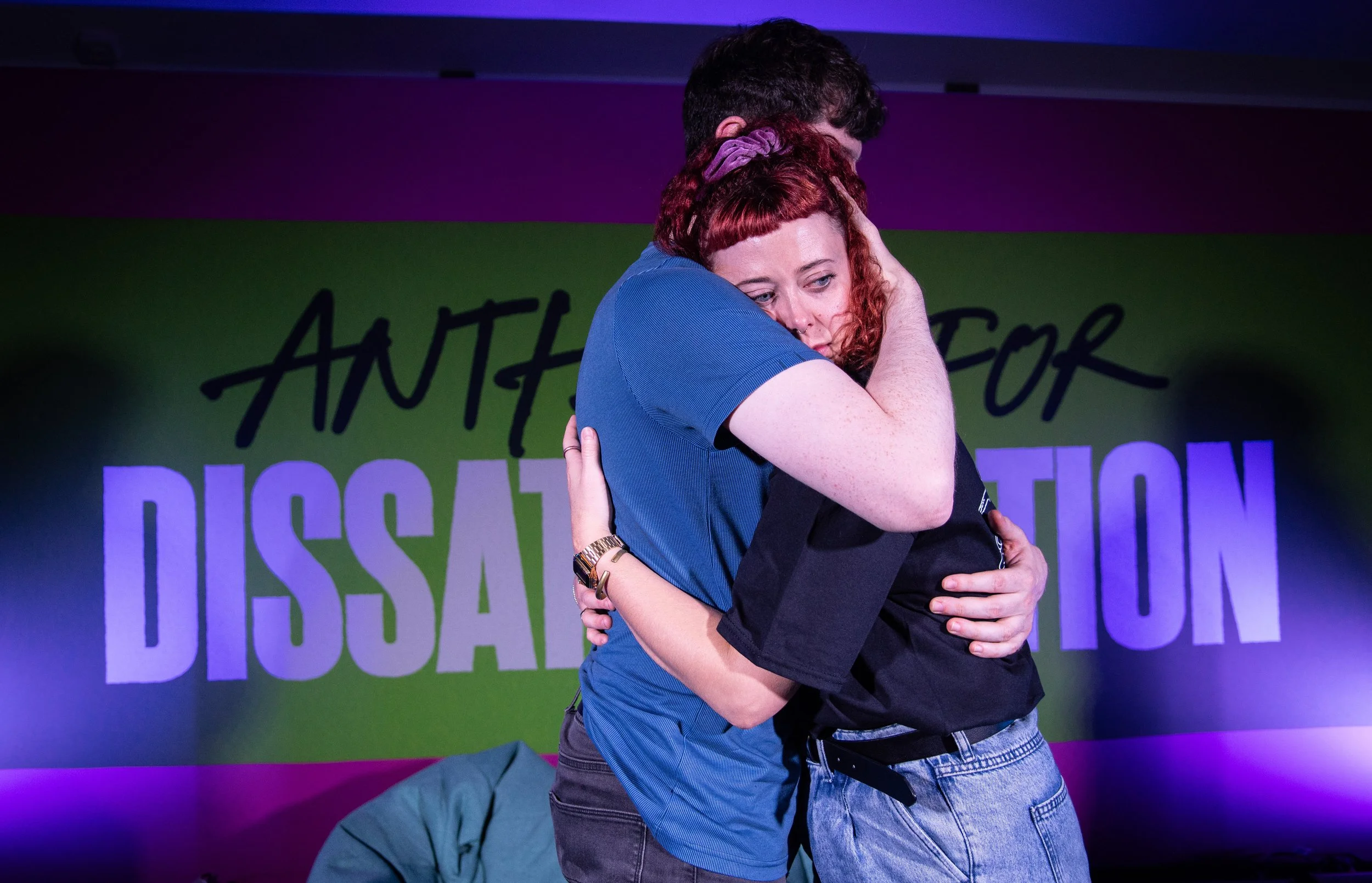
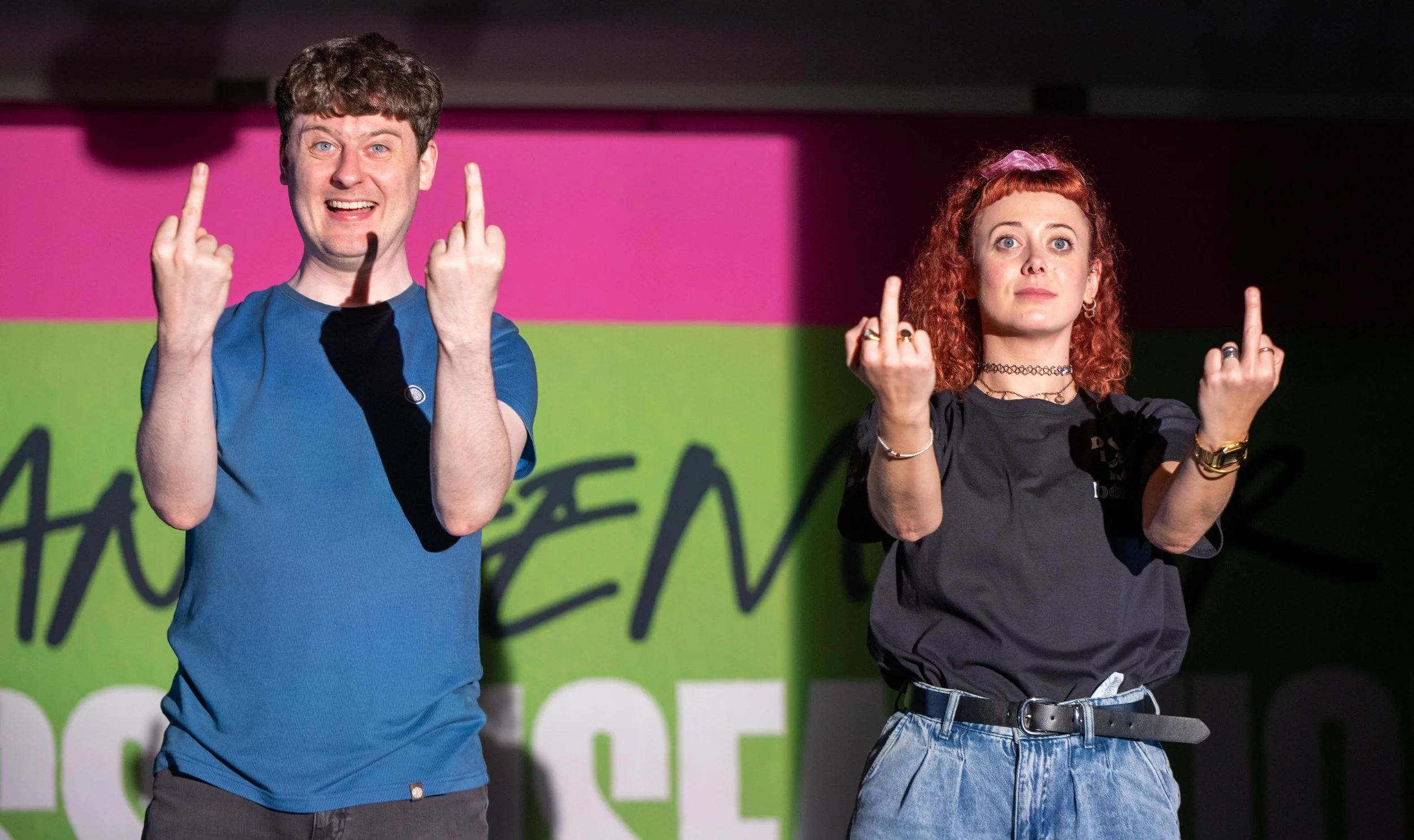
WRITTEN AND DIRECTED BY GINA DONNELLY ANTHEM FOR DISSATISFACTION IS A celebration of the songs, THE people, that punch you in the gut and get you through.
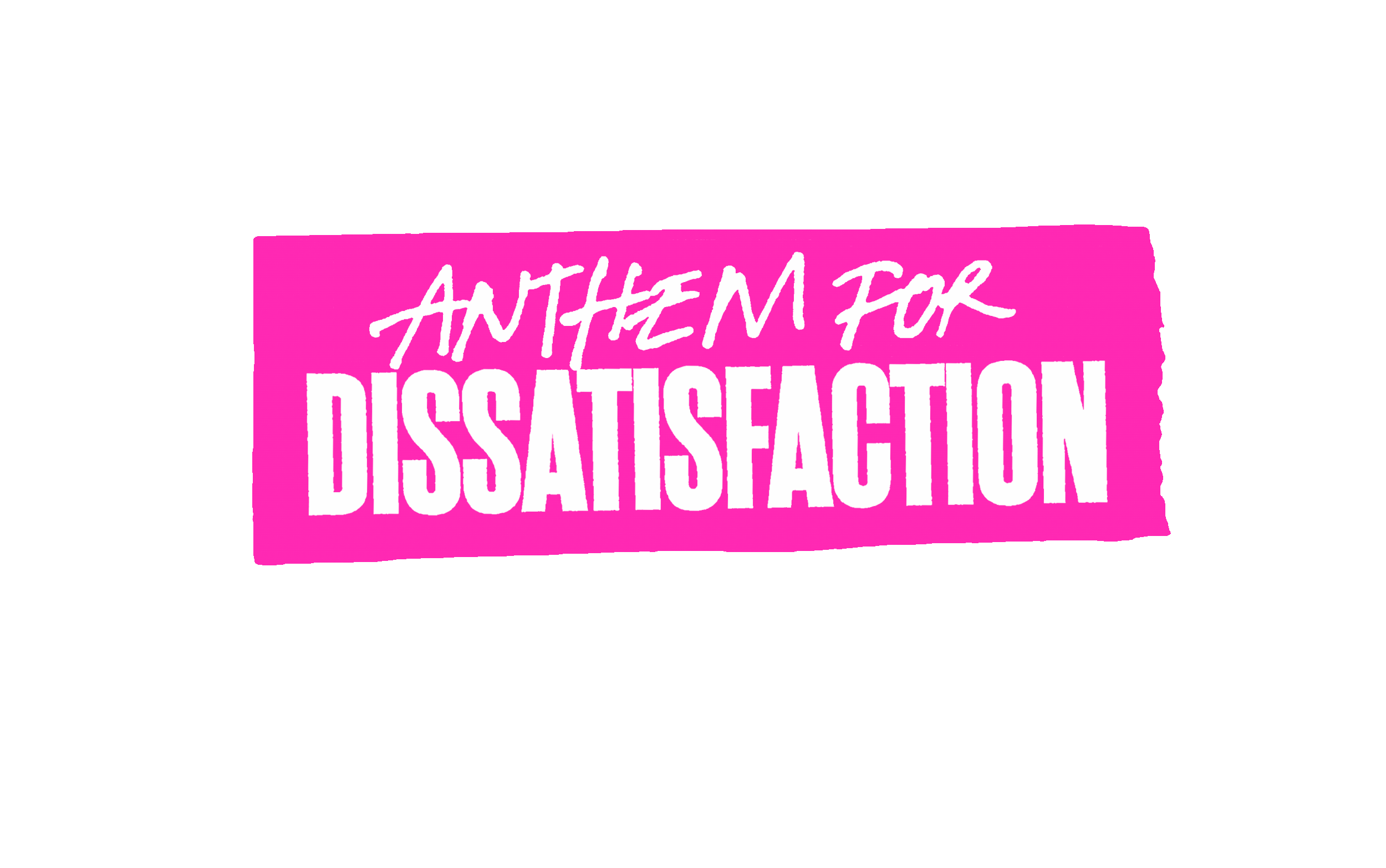
i DESIGNED THE IDENTITY TO BE THAT VISUAL PUNCH IN THE GUT. THE TYPOGRAPHY WAS INSPIRED BY LAST MINUTE SETLIST’S WRITTEN IN SHARPIE AND TAPED THE STAGE. A DAY GLO FLUORESCENT COLOUR SCHEME THAT DEMANDS YOUR ATTENTION AND AN IMAGE THAT SHOWS THE JOY AND HIGH INTENSITY EMOTION BEING IN THE CROWD TOGETHER.
“SONGS AREN’T JUST ABOUT LOVE OR BREAKUPS. THEY’RE ABOUT DESIRE. GAMBLING. SHOUTING. BEING SKINT. FRUSTRATION. LOVE TOO. THEY’RE ABOUT US. ME AND HER. THIS IS OUR LANGUAGE, OUR WAY OF CONSISTENTLY TELLING EACH OTHER: IT’S ALRIGHT MATE I’VE GOT YOU! I GET IT!'
The multi-award-winning gig-theatre show Anthem For Dissatisfaction rejoices in working class strength with wit, integrity, and disarming honesty.
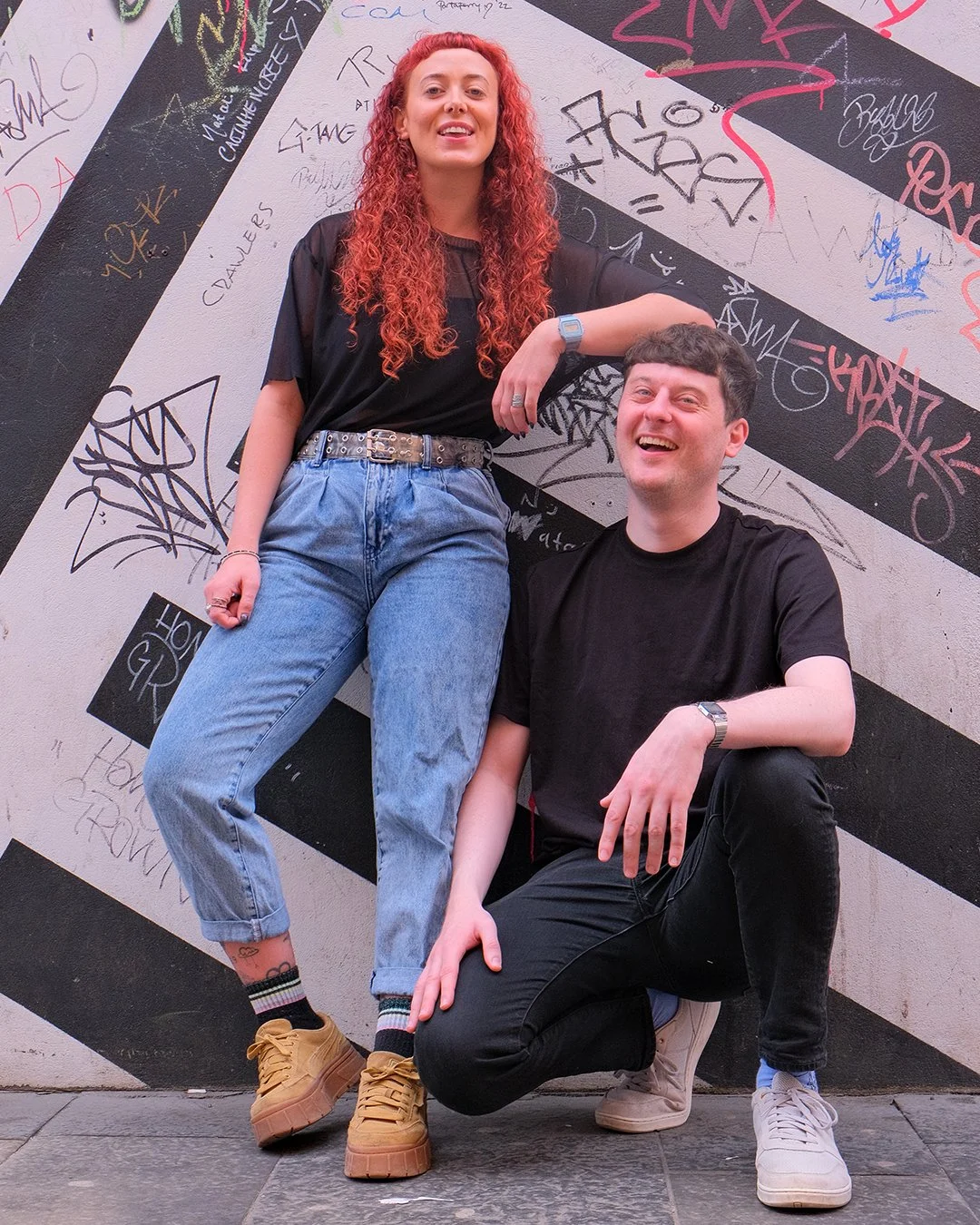
‘Irish Twins’ Sarah and Jamie are growing up in Belfast with a shared obsession of music and the weight of parents on the breadline.
Oasis, The Jam, Springsteen and Sam Fender songs scream at the state of the nation, tugging at the memories of what it means to grow up on benefits in a country where poverty became a punchline. Benefits Britain never sounded so good…
"Despite what D:ream told Us Things Cannot Only Get Better!"
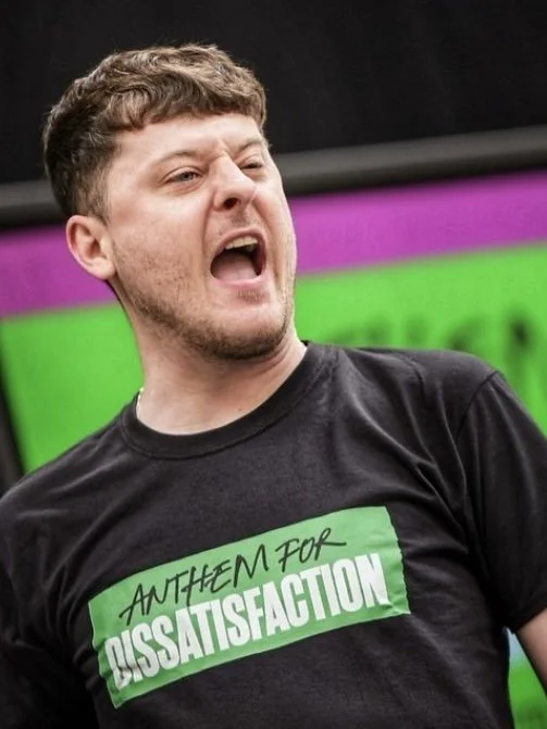
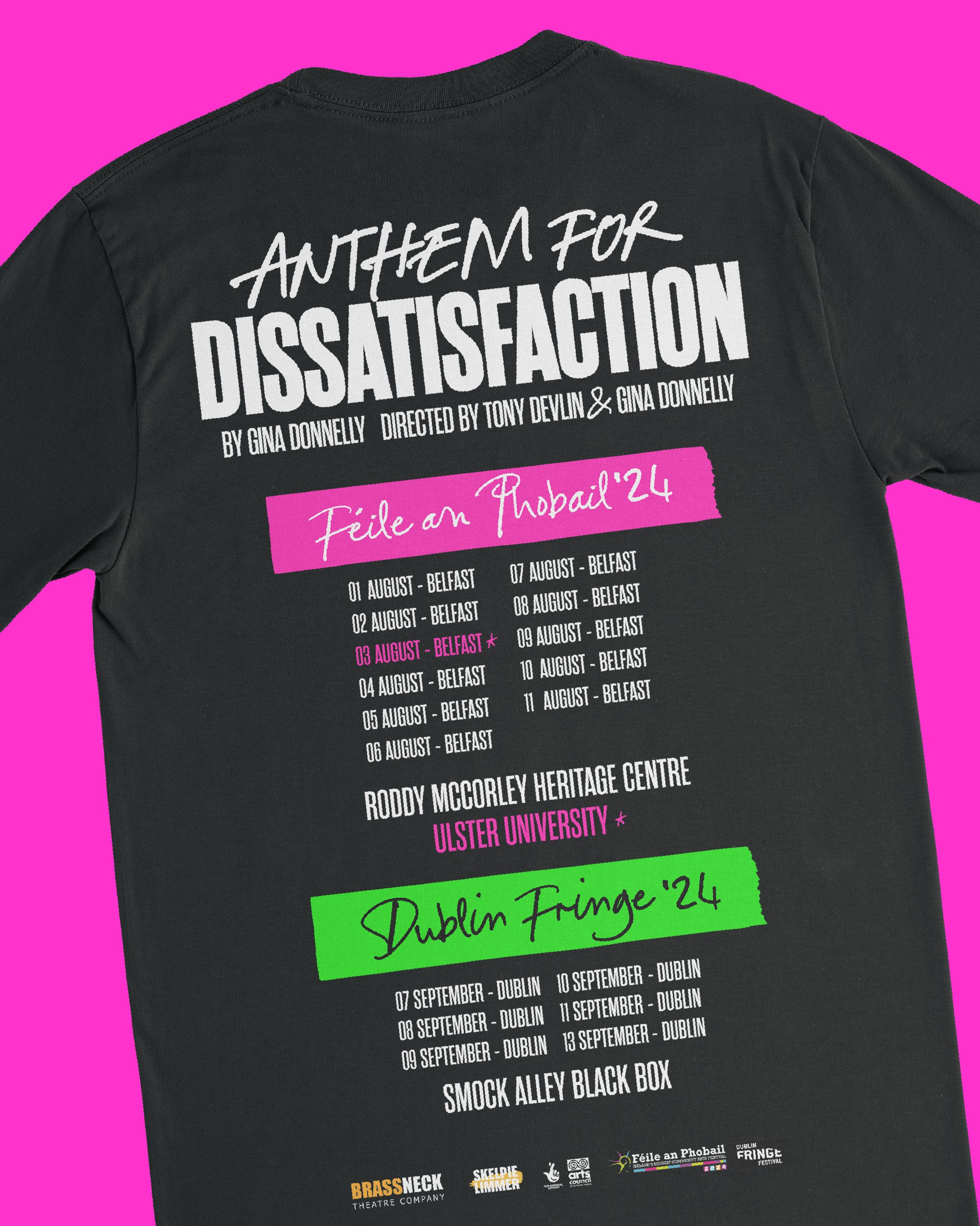
A D:REAM of a show to work on. The gig-theatre aspect of the show allowed for music related promotional graphics including a tour tshirt AND MERCH. The show headed the Edinburgh Fringe the same time as the Oasis Comback AND WITH A SHOW ABOUT 2 SIBLINGS…
the impact
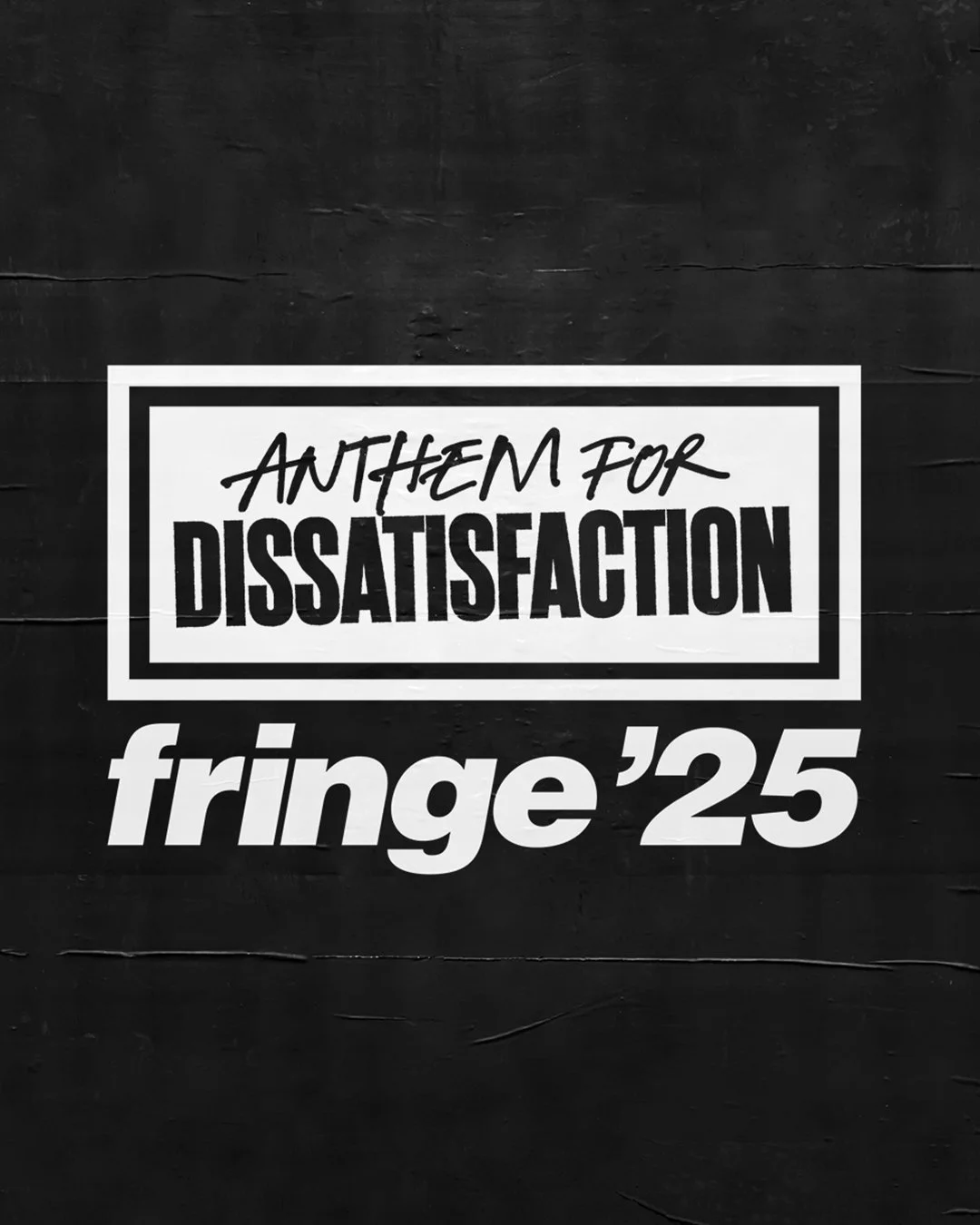
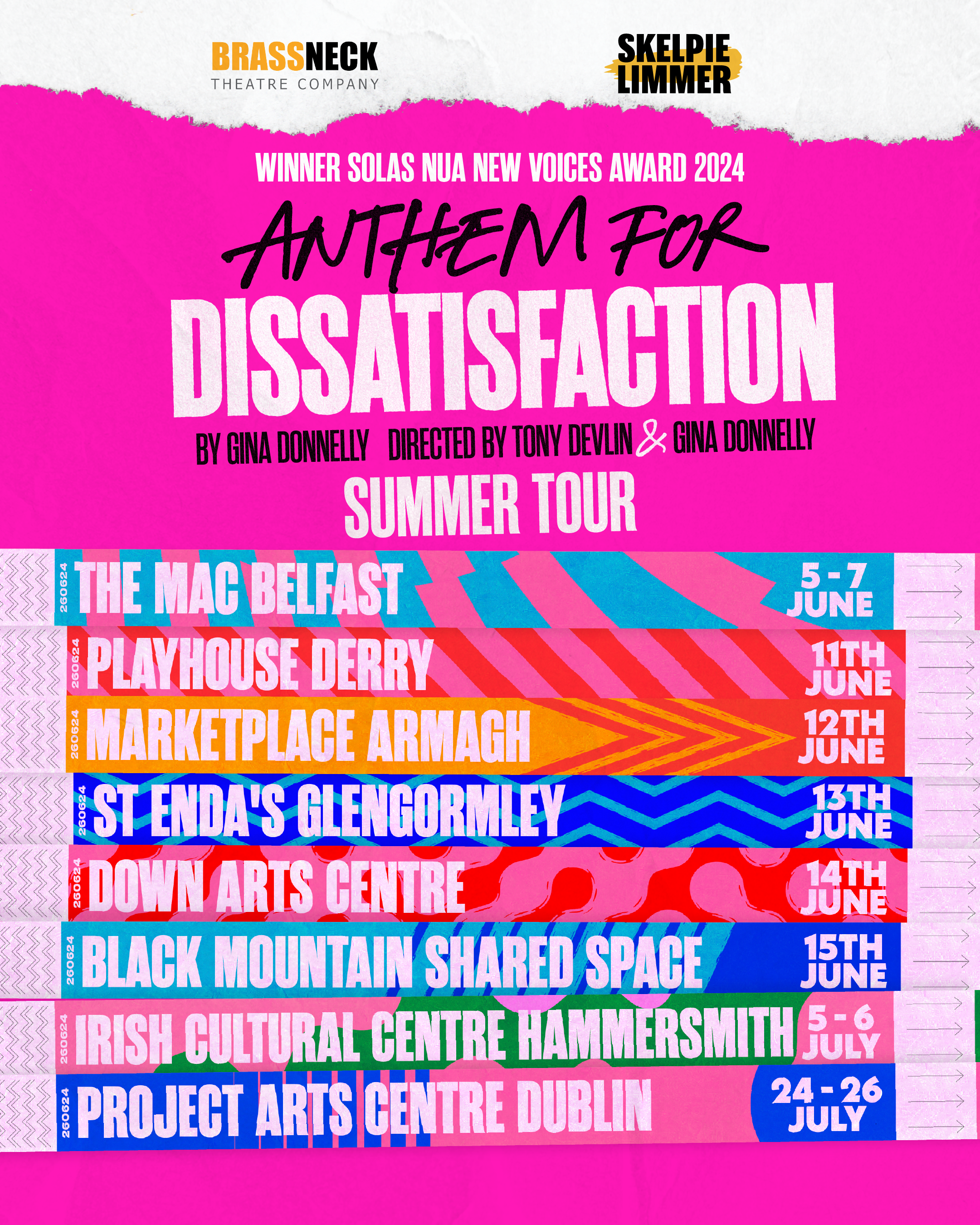
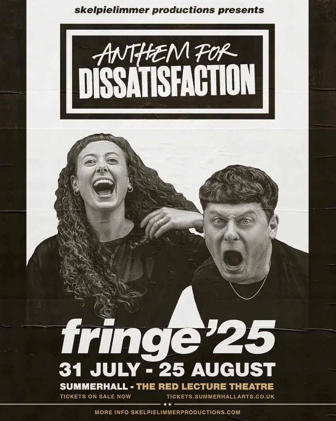
The visual identity has supported the show across multiple festivals In the UK and Europe including Féile an Phobail, Dublin and Edinburgh Fringe. It has functioned as both promotional tool and extension of the performance itself.
THE SCOPE
Title Design
Key Art + Photography
Poster Design
STAGE BACKDROP
MERCH
Social Media Graphics